
AgrestApp

A purchasing system for bakeries, confectioneries, ice cream shops and HoReCa. In the Pesi team I work on the front-end: UI components, the company website, analytics and supplier offer management.

  • Vue 3
  • Inertia
  • Tailwind CSS v4

I work in a team – I only describe the parts where the front-end is mine. The app panel is not public.

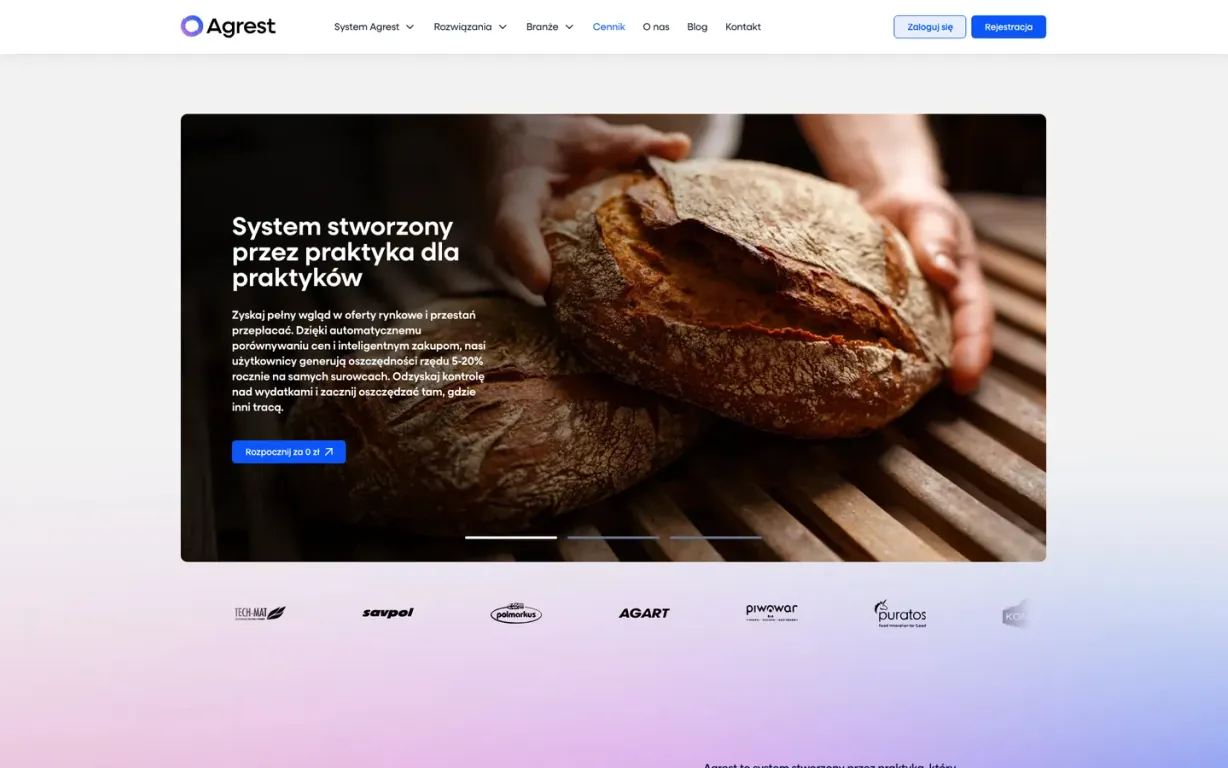
AgrestApp – the first screen of the home page
  • 12 mo.in the project – since October 2025
  • 69icons as Vue components in the new UI set
  • 4industry pages – bakeries, confectioneries, ice cream shops and HoReCa – built from the same sections
  • 296classes in templates left unchanged when moving to Tailwind v4

What I built

AgrestApp is a purchasing system for food businesses: orders and tenders for raw materials, price monitoring, supplier offers and savings analytics. I've been working on it in the Pesi team since October 2025. Several people build the front-end in Vue 3 and Inertia, so below I only describe the parts where the front-end is mine.

What I did

  • UI component set – buttons, an accordion, tooltips, number fields and 69 icons as Vue components; moving the app's buttons to one component and a shared theme toggle
  • Company website – the "About the system" page, a set of sections used to build the pages for bakeries, confectioneries, ice cream shops and HoReCa, price tiles and a pricing page with a payment toggle
  • Analytics – the main chart, the date range picker with a compare mode, top suppliers, the savings summary and product profitability
  • Supplier offer management – extending an existing screen: the individual price dialog, adding items, keyboard work and range selection
  • Shop (now closed) – a basket with each supplier's minimum order, buying without an account, order history and complaints
  • Migration to Tailwind CSS v4 for the whole project

How it looks

The company website and the app panel – analytics with made-up data. Click a screenshot to enlarge it.

  • Analytics – a date range with a slider and fields, two periods compared, savings and a chart (made-up data)
  • Home page – from the first screen to the newsletter
  • "About the system" – sections describing the modules
  • The industry page for ice cream shops – built from the same sections as the others
  • The industry page for confectioneries

1 / 5

Analytics in compare mode

Analytics – a date range with a slider and fields, two periods compared, savings and a chart (made-up data)

Solutions in detail

Things from the code that show best how I work.

  • One date range in three places

    In analytics, the slider, the date fields and the page address show the same range. A change in one place updates the others right away, and the data reloads only a moment after the last change. The calendar won't let you set the start after the end, and the default range starts on the day the company registered.

  • A price table like a spreadsheet

    In supplier offer management, Enter and the arrow keys move to the field in the next row, and its value is already selected, ready to overwrite. Shift-click selects a whole range of rows, like in an email inbox.

  • An individual price without mistakes

    The individual price dialog checks the minimum net price, doesn't accept zero or an empty value, and suggests a default value for a single item. The price turns green when it's lower than or equal to the lowest price.

  • Tailwind v4 without rewriting templates

    Instead of changing hundreds of classes, I brought back three v3 values in the config. Then I compared the output CSS with the previous version, went through the pages and fixed regressions the build didn't report – for example dialogs that hid under their own backdrop after the migration.

← All projects

Got a project in mind?

Or looking for someone to join your team? Write a few sentences – I'll reply within 72 hours.

I'll use your name, email and message only to reply to you. Details in the privacy policy.