
AgrestApp has two headers: one on the company website and one in the panel after logging in. Both worked, but each was built in a different way, and the sizes came from random pixels. On 15 October I rewrote both. It took 8 commits, 40 changed files and +1424 / −923 lines, and the old panel header (643 lines in one file) was replaced by three smaller components. In the next two days I also fixed the icon colours. The screenshots below are from a local version with made-up data.
The menu on the company website
The old menu only worked on mouse hover. It had one group, "System Agrest", with submenus inside a submenu: Industries, Solutions and even Pricing. Widths and gaps were hard-coded (w-[180px], gap-[14px], gap-[30px]).

The most important sections moved to the top level as separate groups, and Pricing became a normal link. The whole structure is in one list in mainNav.js. Both the desktop bar and the phone menu are built from it, so a new item doesn't need changes in two places.

Instead of a separate list for each group, there is one panel. When you move between groups, it slides under the selected item and changes its width and height to fit the content. JavaScript calculates the position and size, and Tailwind only reads them from CSS variables:
<script setup>
// Panel position and size – calculated when a group opens
const panelBox = ref({ x: 0, width: 0, height: 0 })

const panelStyle = computed(() => ({
  '--panel-x': `${panelBox.value.x}px`,
  '--panel-w': `${panelBox.value.width}px`,
  '--panel-h': `${panelBox.value.height}px`,
}))
</script>

<template>
  <div
    :style="panelStyle"
    class="absolute translate-x-(--panel-x) w-(--panel-w) h-(--panel-h)
           transition-[translate,width,height] duration-200"
  >
    <!-- content of the active group -->
  </div>
</template>
The menu reacts to how you use it. A mouse opens a group on hover and closes it only 150 ms after leaving, so an imprecise movement doesn't close the panel. Touch toggles a group with a tap. The keyboard supports Enter, Esc and moving the focus out.
On the phone the groups are accordions, and the login buttons stay fixed at the bottom of the screen. Only the list scrolls.

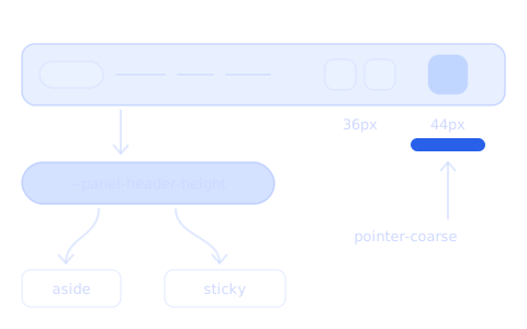
One size rule: mouse 36 px, touch 44 px
In the panel, the icon buttons had different sizes: 30, 36, 40, and the avatar 56 px. Now there is one rule. With a mouse the buttons are about 36 px, because the cursor is precise and a denser layout is comfortable. With touch they are 44 px, which is the minimum from WCAG 2.5.5.
I didn't use breakpoints for this, but the pointer-coarse: variant from Tailwind v4. So the size depends on the pointing device, not on the screen width. A tablet with a mouse gets 36 px, and a laptop with a touch screen gets 44 px.
<!-- 18 px icon + padding: 36 px with a mouse, 44 px with touch -->
<button class="p-2 pointer-coarse:p-3 [&_svg]:size-4.5" aria-label="Notifications">
  <BellIcon />
</button>

<!-- menu item: height from padding, at least 44 px with touch -->
<a class="px-3 py-2 pointer-coarse:min-h-11">My company</a>
The same rule works in the account menu, in the website menu and in the search field (h-9 pointer-coarse:h-11). The menu button on the phone is always 44 × 44 px, so switching ☰ to × doesn't move the bar.
Icons in one colour
After the first version I saw that the icons in the header and in the account menu had different colours. Some took the text colour, and some took a grey from another place. So I set one rule:
- At rest, every icon button in the bar and every icon in the account menu has the same secondary colour:
fill-slate-500, andfill-slate-400in dark mode. - When you hover an item in the account menu, the icon takes the text colour (
group-hover:fill-current), so the text and the icon change together. - The button of the active page gets the solid version of the icon instead of only a background, for example the life ring on the help page.
- The bell with a notification is a separate icon, not a red dot added with
absolute.
A small function chooses the icon variant. The same logic will work for the cart and other icons with a counter:
// One of four names: normal, solid, with a notification, with a notification and solid
function notificationIcon(icon, notification, hasNotification, active) {
  const name = hasNotification ? notification : icon
  return active ? `${name}-solid` : name
}

The header height in one variable
A small change brought the most order. The sidebar and the sticky page bars in the panel sit under the header, so they need to know its height. Before, it was hard-coded: top-[75px], and when an administrator was logged in as another company and the "Log in as" bar appeared above the header, !top-[125px]. The same condition was repeated in several files. One bar still hid 11 px under the header.
Now the "Log in as" bar is part of the header, and the header measures its own height and saves it in a CSS variable on the <html> element:
<script setup>
import { useElementSize } from '@vueuse/core'

const header = ref(null)
const { height } = useElementSize(header, undefined, { box: 'border-box' })

// Header height for the elements that sit under it
watch(height, (value) => {
  document.documentElement.style.setProperty('--panel-header-height', `${value || 72}px`)
}, { immediate: true })
</script>
Every element under the header now has the same class, top-(--panel-header-height). It doesn't need to know if the "Log in as" bar is visible or how tall the header is on a given screen.


Scale values instead of pixels in brackets
Tailwind v4 accepts any multiple of 0.25rem, so most bracket values could become normal classes:
| Before | After |
|---|---|
h-[75px] | h-18 (72 px) |
w-[239px] | w-60 (240 px) |
py-[22px] | py-5.5 |
dark:bg-[#161e30] | a colour from the project palette |
In the website bar one gap needed a fluid value. Between the logo, the menu and the buttons there is a clamp(), from 16 px at 1024 px width to 84 px at 1440 px. Thanks to this, the whole menu fits from 1024 px, without extra breakpoints.
What I got from it
- One menu list for desktop and phone.
- One size rule (36 / 44 px) instead of several random ones.
- One icon colour at rest and a solid icon for the active page.
- One variable with the header height instead of the numbers 75 and 125 in several files.
- A menu that works with a mouse, touch and the keyboard.
The website dropdown has the same spacing as the account menu in the panel. Both parts now look like one system, even though they are separate apps.